%201.avif)


Understanding Water-based print results on Comfort Colors
Oct 14, 2025
min read
When it comes to printing water-based inks on Comfort Colors® garments, knowing how your artwork will appear on different dye types is key to getting the look you want.
When it comes to printing water-based inks on Comfort Colors® garments, knowing how your artwork will appear on different dye types is key to getting the look you want.
When it comes to printing water-based inks on Comfort Colors® garments, knowing how your artwork will appear on different dye types is key to getting the look you want. Comfort Colors’ pigment and reactive dye processes affect how much ink discharges through the garment dye - meaning your design’s final vibrancy can vary from bold and bright to soft and vintage.
In this guide, we’ll break down the four main categories of print results: Reactive Dyed, 90% Vibrancy, 70% Vibrancy, and 40% Vibrancy.
Reactive dyed garments deliver the most vibrant print results. These shirt colors release more dye when printed, allowing the water-based ink to fully discharge and produce bright, bold colors that pop right off the fabric.
Other Reactive Dyed Colors include: Red, Midnight, White, and China Blue
.webp)
Pigment dyed garments naturally have a soft, washed-in look, and they’ll continue to fade slightly over time for that perfect “lived-in” feel. Colors in this range print at about 90% vibrancy, meaning they still hold strong color but with a subtle vintage look.
Other 90% Pigment Dyed Colors include: Citrus
.webp)
These garments bring a classic vintage feel - the kind of tee that looks like it’s been your favorite for years. Prints appear softer, more muted, and intentionally weathered.
Other 70% Pigment Dyed Colors include: Neon Cantalope, Neon Lime, Bay, Mustard, Melon, Orchid, Hydrangea, Celadon, Bright Orange, Burnt Orange, Royal Caribe, Sapphire, Bright Salmon, Crunchberry, Watermelon, Seafoam, and Ice Blue
.webp)
This category represents the most vintage of pigment dyed results. The garment color holds onto more of its original pigment, giving your print a subtle, tonal appearance. Think soft, muted designs that look like they’ve been sun-washed over time.
Other 40% Pigment Dyed Colors include: Periwinkle, Grass, Boysenberry, Violet, Blue Jean, Flo Blue, Yam, Neon Pink, Cumin, Crimson, Blue Spruce, and Hemp
.webp)
Here’s where the difference really shows. Both Graphite and Pepper are dark gray Comfort Colors tees - but their dye processes create dramatically different print results.
This comparison is the perfect example of why knowing your garment’s dye type matters when planning your artwork as the base color and dye process can completely transform the final result.
.webp)
Understanding how your garment’s dye impacts print results helps you choose the perfect combo for your design. Whether you’re aiming for bold and bright or soft and nostalgic, our team will help ensure your Comfort Colors order prints how you envision it.

Stay up-to-date with the latest trends and news.
From sermon notes to discipleship programs, the Woothoop+ NFC wristband is one of the most versatile tools in your church's toolkit. Here's how to use it.
So you've got a wristband that taps open any URL on any phone.
Cool. Now what?
Turns out, "any URL" is doing a lot of heavy lifting for churches and ministries.
Sermon notes. Event signups. New member onboarding. Discipleship resources. Church-wide campaigns.
The Woothoop+ isn't a novelty. It's a utility — one that meets people where they already are (on their phones) and gets them where you need them to go.
Here are six ways to put it to work.
Be honest.
How many bulletins end up in the seat pocket? On the floor of the car? In a jacket that goes to the dry cleaner?
Program the Woothoop+ with your digital sermon notes page and that problem disappears.
Attendees tap it during the week, mid-commute, whenever they feel like revisiting what was taught.
No email to dig through. No URL to remember. Their wrist knows the way.
"I meant to sign up but I couldn't find the link."
We've all heard it.
With the Woothoop+, the link is literally on someone's wrist.
Point the chip at your registration form and hand out bracelets at the event announcement. Tap. Done. Signed up.
Works great for:
The fewer clicks between interest and action, the more signups you get. That's just science.
When someone is new to your church, they have a lot of questions.
Where do I serve? What groups can I join? Who do I talk to?
Instead of handing them a brochure that ends up in the recycling bin, give them a Woothoop+ linked to your welcome page.
Service times, staff contacts, ways to get connected — all one tap away.
And every time they glance at their wrist, there it is.
Your church, keeping up with the times.
You don't have to convince a student to wear a bracelet. That's already their thing.
The Woothoop+ just makes it do something.
For camps, retreats, and lock-ins:
For ongoing student ministry, distribute them at the semester kickoff and keep the link updated with weekly resources.
They stay connected. You stay relevant.
Win-win.
Here's the honest truth about discipleship resources:
People want to use them. Life gets in the way.
A reading plan in an email gets buried. A workbook gets left in the car.
But a bracelet on your wrist? That's harder to ignore.
Program the Woothoop+ with your discipleship content — a reading plan, a video series, a prayer guide — and give every participant one at the start of the program.
One tap is all it takes to get back on track.
And honestly? It makes the whole program feel more official. More like something worth committing to.
Capital campaigns. Community outreach pushes. 21-day prayer challenges.
The hardest part of any church-wide initiative isn't launching it.
It's keeping people engaged two weeks in.
The Woothoop+ keeps the campaign literally on people's wrists.
Tap for the giving page. Tap for the challenge tracker. Tap for the daily devotional.
Every time they look down, the commitment is right there.
That's not accidental. That's momentum.
The Woothoop+ on its own is great.
Paired with a Super-Soft Tee or Super-Soft Hoodie from the same event?
That's a full experience.
The shirt carries the visual identity. The bracelet carries the connection.
Your group looks unified, stays connected, and has a reason to pull out their phone that isn't just doom-scrolling.
You're welcome.
👉 Ready to add the Woothoop+ to your next order? Let's create something great.
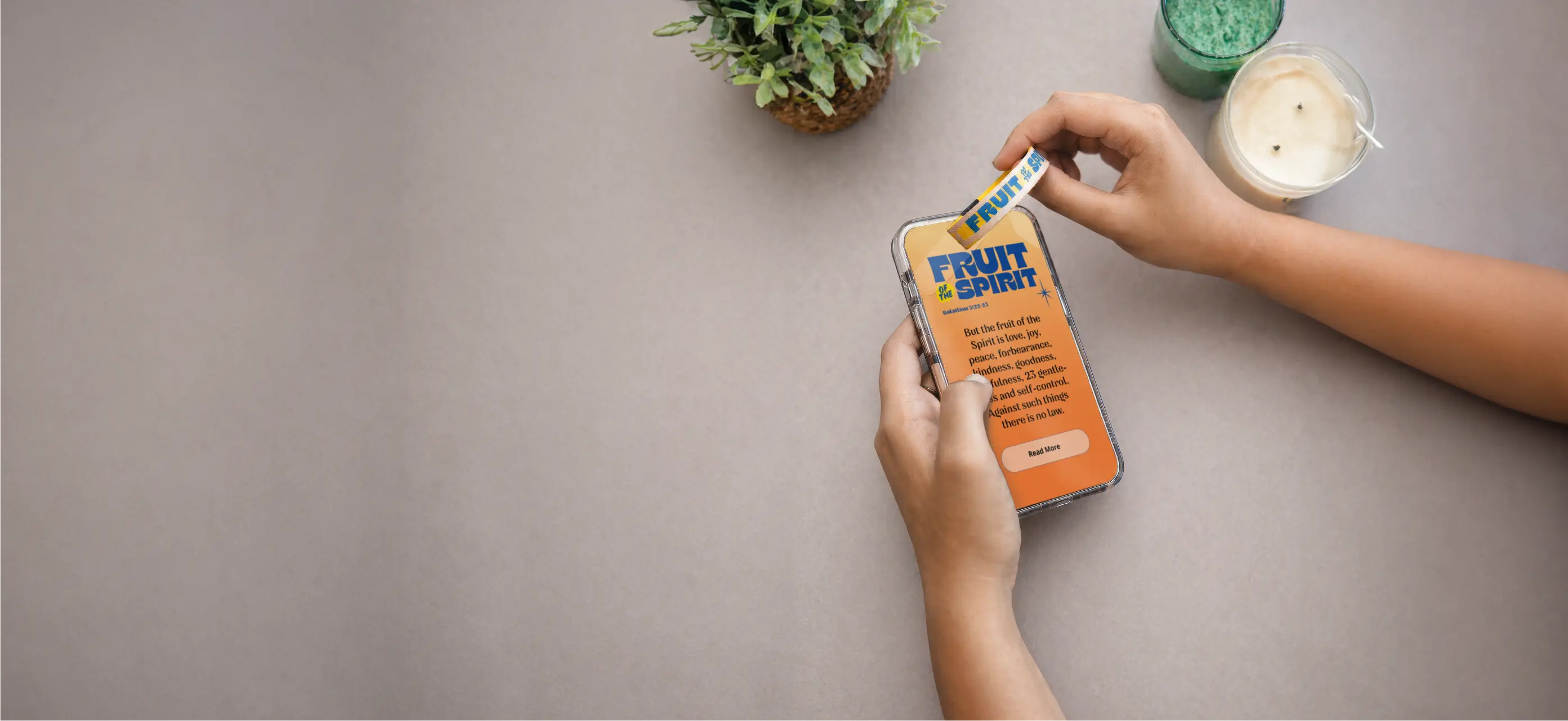
The Woothoop+ is a custom wristband with NFC tech that opens any URL with a phone tap. Here's how it works, the full product specs, and ordering details.
Your wristband just leveled up.
The Woothoop+ is Sunday Cool's custom NFC wristband — same soft elastic build as the original WootHoops, now with a chip inside that opens any URL the moment someone taps their phone to it.
Sermon notes. Event signups. New member pages. Your church website.
One tap. Instant access. No app required.
Here's the full breakdown.
Good question. NFC stands for Near Field Communication.
It's the same tech that lets you tap your phone to pay at checkout.
Your phone already has a reader built in. No app needed. No QR code. No hunting for the right link.
Just tap.
When someone taps their phone to a Woothoop+ bracelet, it opens a webpage — instantly.
That's it. That's the whole trick.
Picture this.
Someone at camp is wearing a Woothoop+. Their phone buzzes near it.
Their screen opens directly to your event schedule, your sermon notes, your registration form — whatever URL you programmed into it.
No typing. No "wait, what's the link?" No dropped QR codes on a crumpled bulletin.
Just a tap. And it works.
The Woothoop+ is built on the same soft-woven elastic as the original WootHoops — one of Sunday Cool's most-loved promo items.
Here's what you're working with:
Both sides are printable. So your logo, a Scripture, your event theme — it all fits.
When you place your Woothoop+ order, you tell us where you want the chip to go.
We program that URL into every bracelet before they ship.
Every single one.
Where can you point it? Basically anywhere:
If it has a URL, the Woothoop+ can open it.
Here's the ordering info, no fluff:
Pricing by quantity:
For large-scale camps, conferences, or church-wide events — that per-piece cost gets genuinely hard to beat for something this interactive.
Most merch does one job: look good.
The Woothoop+ looks good and does something.
Every single time someone puts their phone near it, you have a direct line to wherever you need them to go.
That's not just swag. That's a tool.
👉 Ready to get started? Order your Woothoop+ with Sunday Cool today.

Discover creative VBS shirt ideas inspired by Illumination Station by Lifeway for VBS 2026. Explore customizable designs and cohesive merch for your theme.


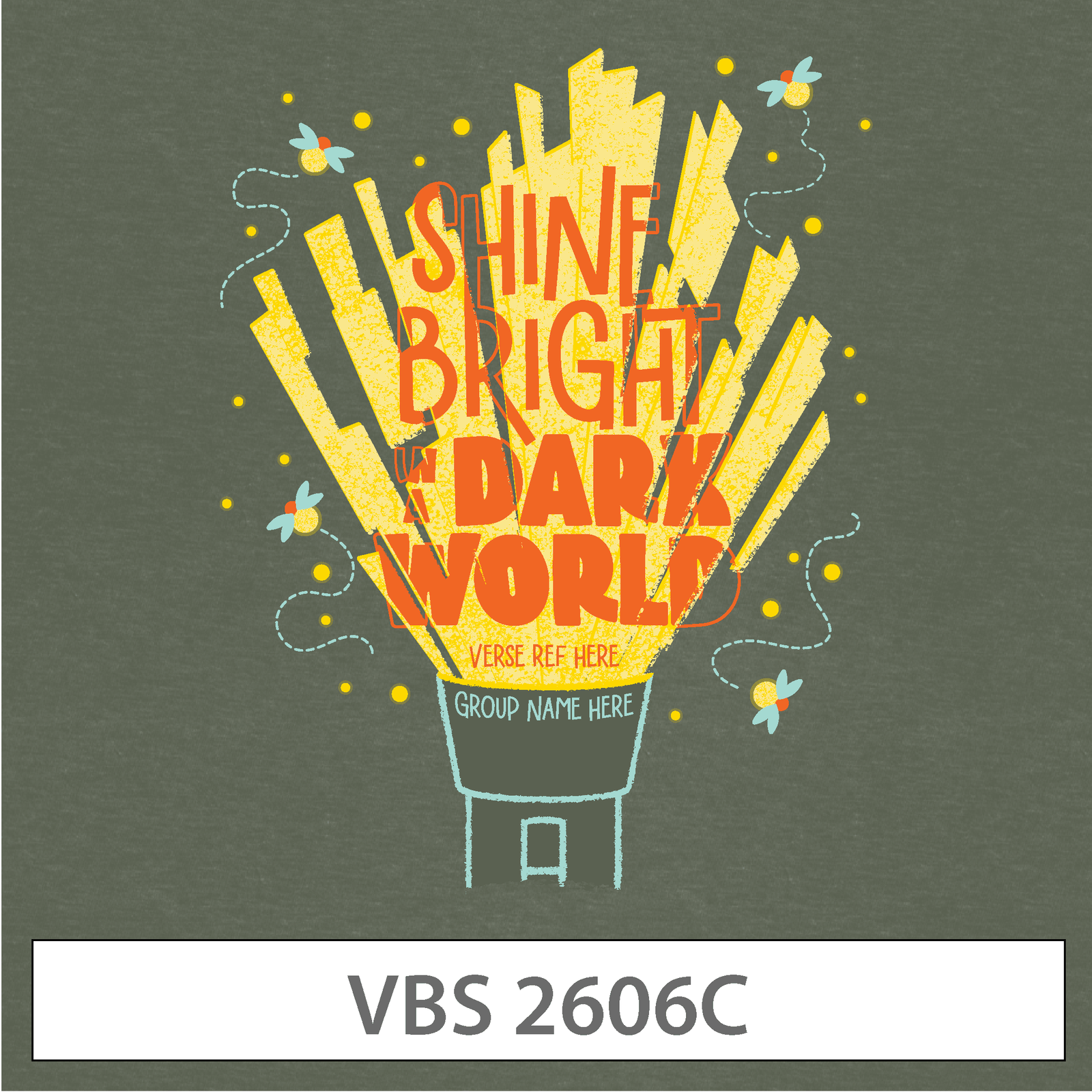
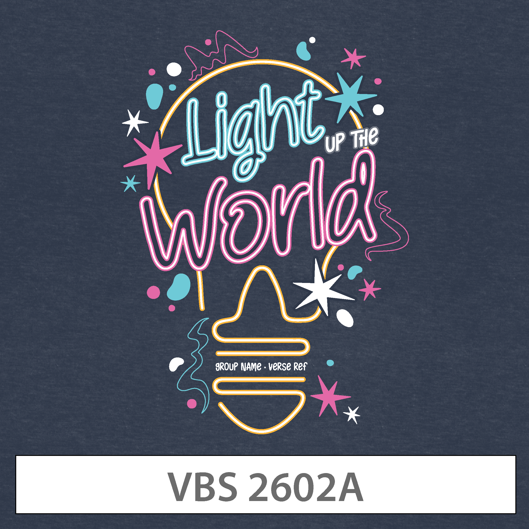

Every VBS is a little different.
With Sunday Cool, you can:
All designs pair perfectly with our Signature Super-Soft Tee, available in youth and adult sizes across most colors.
Soft, lightweight, and easy to wear — so kids actually want to keep it on all day.
These designs are inspired by popular VBS themes and are not affiliated with or endorsed by Lifeway.