Oops! Something went wrong while submitting the form.
How to Choose the Right Shirt Color for Your Church or Youth Group
Color is one of the first design decisions you'll make — and one of the most consequential.
The wrong color makes a sharp design look flat. The right color makes a clean design look sharp.
Here's how to think through shirt color so you land on something your group is glad to wear.
Feb 26, 2026
min read
Copied!
Shirt color affects how your design prints, how often the shirt gets worn, and how your ministry looks to the outside world. Here's how to choose well.
Lead With Wearability
Before you pick a color that looks interesting, ask a more practical question: will people actually wear this outside of the event?
Neutral and near-neutral tones — black, navy, heather gray, natural, slate, olive — get worn most because they work with whatever someone already owns. They're not trying too hard.
Bright colors have a place — camps, VBS, high-energy outdoor events — but they have a narrower window of everyday use. If the Super-Soft Tee is going to become a genuine wardrobe item, neutral tends to win.
Consider How Ink and Shirt Color Interact
Your ink color and garment color work together as a system — not independently.
Dark shirts (Back, Heather Denim, Heather Charcoal) give you high contrast with lighter inks and open the door to bold, graphic-forward designs. Light shirts (White, Heather Tan) allow for full-color printing with more flexibility in the design.
Mid-tones (Heather Mudd, Heather Gator, Heather Slate Blue) require more careful ink selection — you need colors that pop without blending in. When you're not certain how a combination will look, Sunday Cool's art team can show you a digital mockup before you commit to a full run.
Align With Your Ministry's Visual Identity
If your church has a defined brand palette, staying in that family creates visual consistency — from your social media to your stage design to what your team is wearing.
If your ministry doesn't have a formal palette yet, think about the aesthetic you want to project: modern and minimal (black, white, charcoal), warm and welcoming (cream, terracotta, sage), or bold and high-energy (royal blue, red, bright orange).
Color is part of your identity whether you're intentional about it or not. Might as well be intentional.
Two Colors, One Design
If budget allows, ordering the same design in two garment colors gives your group options — and makes the merch feel more complete.
A common pairing: a dark option (black or navy) alongside a lighter option (white, natural, or heather gray). The same design runs on both, with minor ink color adjustments.
This approach also works well for differentiating groups at the same event — staff in one color, students in another — without requiring two completely different designs.
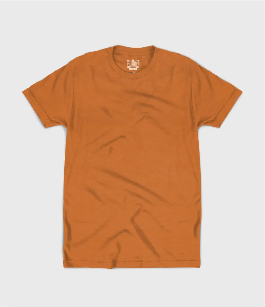
Warm, bold, and exactly what fall is supposed to look like.
Heather Mudd
A neutral that leans into the season without trying too hard.
Heather Gator
Deep, moody, and unlike anything else in the lineup.
Heather Honey
Golden and warm — the color equivalent of a fall afternoon.
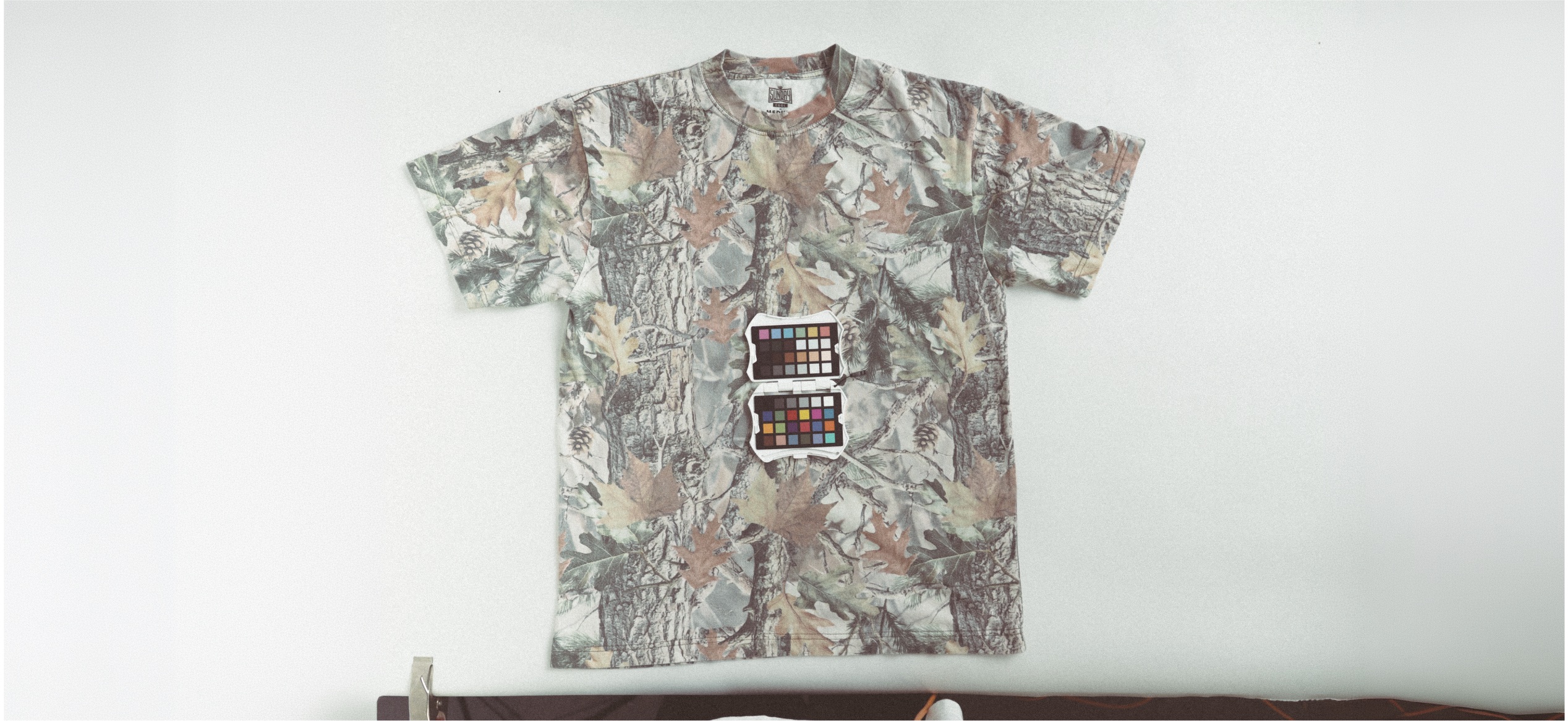
Vintage Camo — Oversized Boxy Tee
A textured, layered print that brings a rugged, outdoorsy edge to the season. Exclusive to the Oversized Boxy Tee, so the fit does just as much work as the color.
Bonus: Cool-Weather Colors Worth Knowing
Fall isn't just about tees. A few standout shades across our other cool-weather apparel are worth adding to your fall lineup:
They lean warm instead of bright. They photograph beautifully against changing leaves and string lights. And they pair naturally with the vintage, badge-style designs that are trending in apparel right now.
Paired with Super-Soft Ink, every one of these shades stays as comfortable as it looks — no stiff, plasticky print to work against a good color.
People Also Ask
What are the best t-shirt colors for fall church events? Warm, earthy tones like Heather Pumpkin, Heather Mudd, and Heather Honey are popular fall picks because they feel seasonal without being overly bright.
Do darker colors work better for fall and winter apparel? Yes. Darker, richer tones like Heather Gator, Black, and Fern Green tend to feel more appropriate as temperatures drop, and they pair well with heavier fabrics like fleece.
What's the difference between the Super-Soft Tee and Oversized Boxy Tee color options? Some colors, like Vintage Camo, are exclusive to specific garments. The Oversized Boxy Tee offers a few unique prints and textures not available on the standard Super-Soft Tee.
Can I pair these fall colors with specialty inks? Yes. Super-Soft Ink works beautifully across all of these tones, and darker shades like Heather Gator or Black can make lighter ink colors really pop.
Colors That Bring It All Together
Once you have the right shirt, color is what makes it stand out.
The right shade can help your design pop, unify your group, and make the shirt something people actually want to wear once the event's over.
Looking for the design to go with it? Check out our post on trending fall t-shirt designs for ideas that pair perfectly with these colors.
👉 Ready to Get Started? Browse the full Super-Soft Apparel lineup or start your custom order HERE
JumpStart Youth Rally has always had strong energy in the room. What it hasn't always had is a way to keep that energy going once the weekend ends.
"That's always kind of been a dream of several people — how do we keep in contact post-event. We had decent engagement through social media, posting some recap videos, some photos, some talking points, but..."
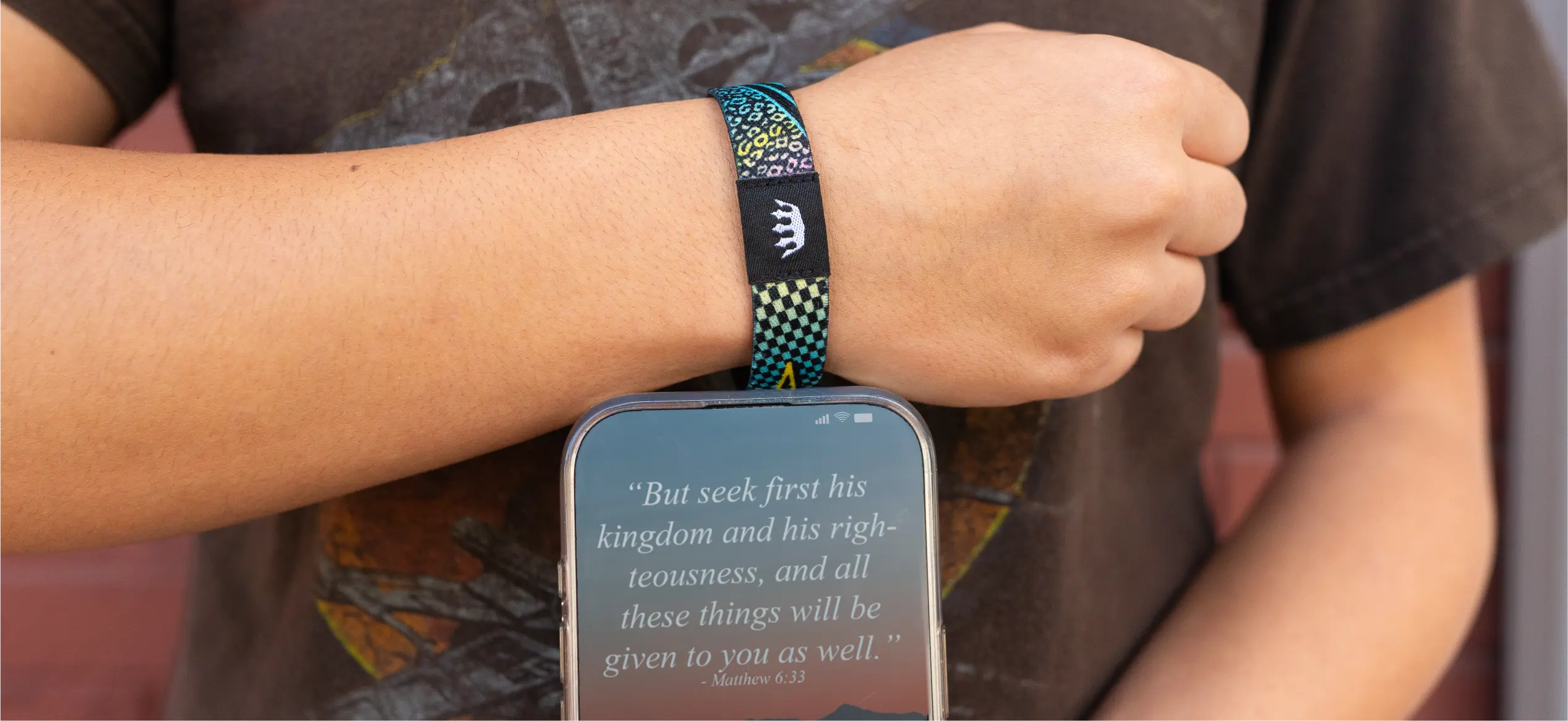
Zac's team had used standard silicone wristbands in years past, and a WootHoop the year before this one — which students loved and actually wore, unlike previous giveaways. But when Sunday Cool introduced Woothoop+, with an NFC chip built into the same soft-woven band, Zac saw an opportunity to do more than hand out a wristband. He saw a way to hand out a direct line to his students that would outlast the weekend.
The Partnership
The order almost didn't happen. Zac placed it just two and a half weeks before the event — while on vacation at Disneyland.
"We got them ordered within a day. I don't even think it was a 24-hour process to get everything turned around, and it was so simple."
Sunday Cool's Project Advisor, Stacia, got the wristbands designed, produced, and delivered five days before the rally kicked off.
"She's been so patient with me, and honestly, she's a miracle worker sometimes. She makes the process so easy. That is why we will keep coming back to Sunday Cool as often as we can."
For the link itself, Zac's team didn't need a new website or a developer. They used their existing church platform (Subsplash) and simply added a page to their current site — no new domain, no extra infrastructure.
"It was actually easier for us to use our church website and just add a special link to that."
The Moment
Wristbands went out at registration Friday afternoon. Some got worn right away. Some didn't — until Friday night, when Zac took the stage, held up his own wristband, and tapped his phone to it in front of the whole room.
"I said, hey, this will also give you all the information you need to know about the weekend. And that's when everyone was trying to get their Woothoops that weren't wearing them previously. They wanted it at that point."
The reaction was immediate: 307 of 355 registered attendees — 86% of the room — connected that weekend.
From there, the team used the link dynamically all weekend long: live schedule updates, breakout room assignments, speaker verses and images pushed the moment a session started. On Saturday, they used it to distribute a digital faith-story worksheet a college student had built for the event — something students could now revisit anytime, just by tapping their wrist.
"We were able to really give them a detailed schedule every time they scanned that wristband... and one of the things we wanted to do especially for this theme, there was a little booklet on how to write your faith story — that was able to be directly put on the Woothoop."
The Result
The weekend ended, but the link didn't stop working. Zac's team repointed the same URL toward daily devotionals tied to the rally's theme — something students could keep engaging with well into the fall.
"It's still on their Woothoop. If they scan it now, they can access that at any time."
Three weeks post-event, engagement had settled into a rhythm: from an initial 50–75 daily scans down to a range of 7 to 30-plus on any given day.
"That's about 10% who are coming back, and we're happy with that. We love that."
The reaction wasn't limited to students, either.
"The adults were the most impressed. I had other youth ministers and chaperones coming up like, how does this work? Tell me how to make this work."
One college recruiter at the event was impressed enough to place his own order — planning to embed his application link directly into a Woothoop+ for his upcoming recruiting season. And Zac isn't waiting for next summer to use his again: he's now handing Woothoop+ out to first-time visitors on Sunday and Wednesday nights, pointed at the church's calendar and event schedule.
On product quality specifically, Zac didn't hold back:
"The designs are fantastic. The shirt quality is like — you can't get any better, super soft. And the ink is just baked right in. So that's why we wanted to give credit where credit was due — you're not just buying a t-shirt."
The Ask
JumpStart Youth Rally isn't a one-off. It's a 28-year tradition that just found a new way to stay connected to the students who show up for it — well past the weekend it happens.
If your church, camp, or ministry is planning an event where you need to get information into people's hands fast, and keep them engaged after it ends, Woothoop+ is built for exactly that.
👉 See how Woothoop+ works, or start your own order HERE.
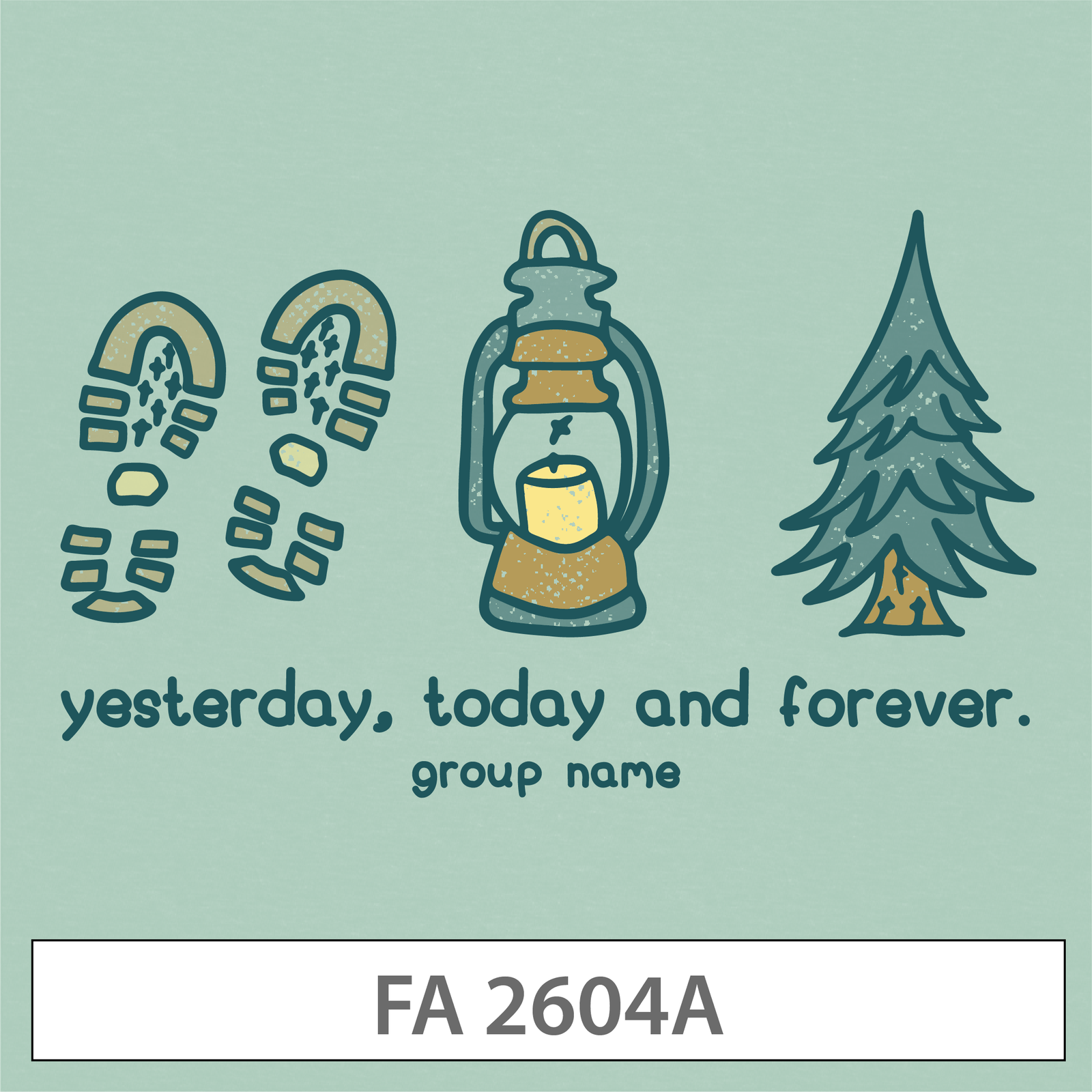
There's something about hiking boot footprints, a glowing lantern, and a pine tree with a campfire glow at its base that just says fall retreat without saying a word.
This design leans into the quiet, cozy side of fall — muted sage green background, soft hand-lettered type, and a color palette that feels more "cabin weekend" than "back to school." The line "yesterday, today and forever" gives it a Scripture-adjacent feel (Hebrews 13:8, if you're looking for the reference) without spelling it out, which keeps it feeling more like a retail graphic than a churchy one.
Why it's trending: Muted, nature-inspired palettes and hand-lettered fonts are everywhere in fall apparel right now — this design taps into that exact look. It's also a natural fit for the Super-Soft Crewneck or Super-Soft Hoodie, since the illustration style pairs beautifully with fleece.
Great for: Fall retreats, camp weekends, small group kickoffs
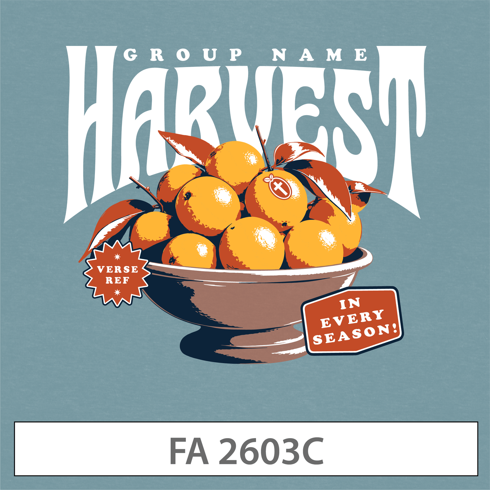
Bold, arched vintage type stacked over an illustrated bowl of oranges — this one has serious "old general store sign" energy, and it's one of the strongest typography moments in this whole lineup.
The small sticker-style tags ("VERSE REF" and "IN EVERY SEASON!") add a layered, collage-like feel that's very on-trend right now, while the warm slate blue and burnt orange color combo keeps it feeling autumnal without going full pumpkin-spice cliché.
Why it's trending: Stacked vintage serif type paired with illustrated still-life elements is one of the biggest design trends in apparel this year — think farmers market posters, not clip art. It's a design that would genuinely look at home on a store shelf.
Great for: Ministry kickoff, harvest festivals, fall Sunday services
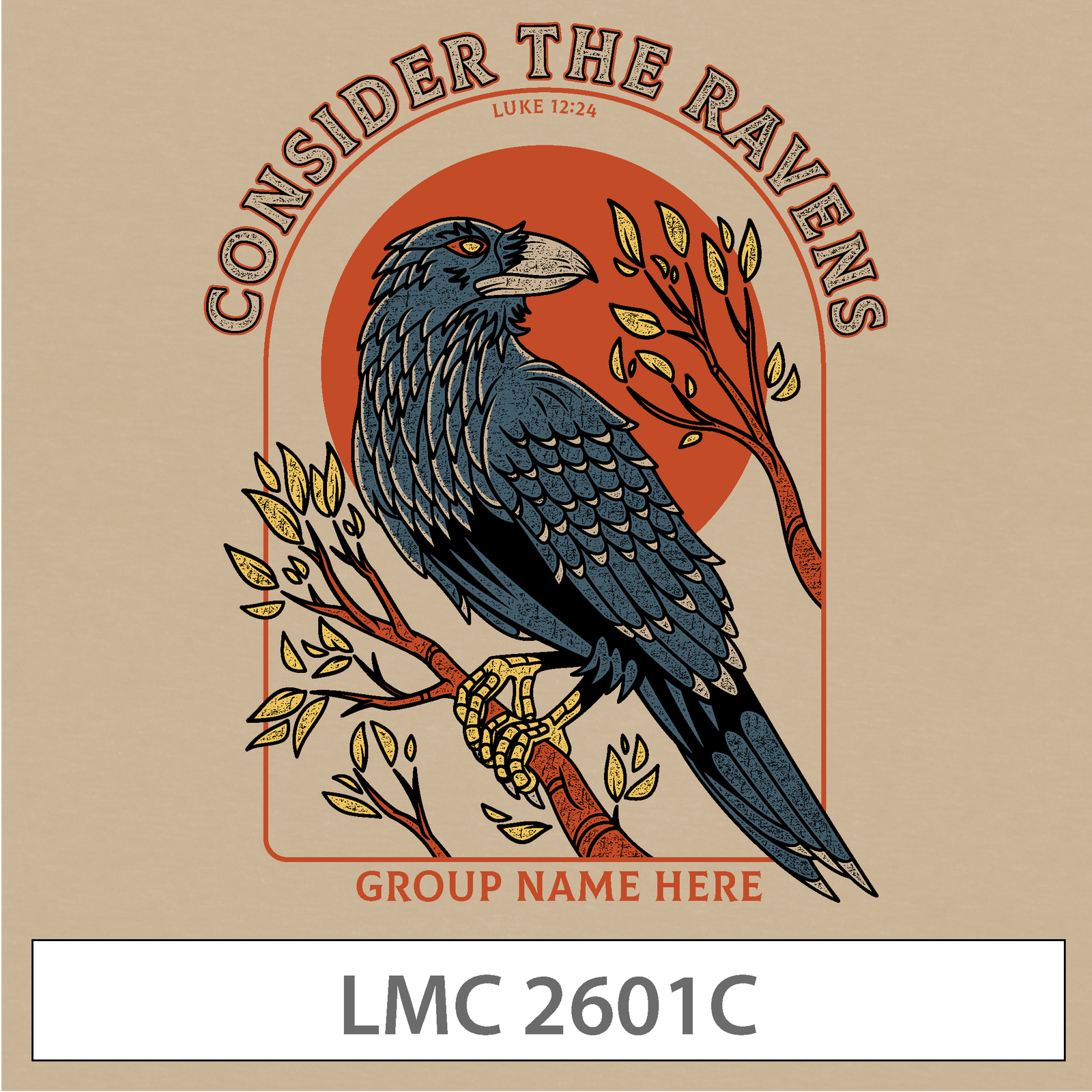
This one's a standout. A finely detailed raven illustration, perched on a branch in front of a warm orange sun, framed inside a badge-style border with "CONSIDER THE RAVENS" arched overhead and the Luke 12:24 reference tucked underneath.
It's easily the most illustrative, artist-driven design of the group — closer to a nature field guide or a national park badge than a typical church tee. The tan background and earthy color palette give it real depth without feeling busy.
Why it's trending: Badge-style illustration with a single, striking animal subject is huge right now, especially in the outdoor and nature-inspired apparel space. It's also a great option if your group wants a design that leads with Scripture and lets the art carry the weight.
Great for: Fall retreats, DNOW weekends, student ministry apparel
Big, bold, collegiate-style lettering stacked over an illustrated acorn and oak leaf, wrapped in a retro groove-line frame — this design is loud in the best way.
The brick red background and cream typography give it a varsity, homecoming-poster kind of energy, while the small "VERSE REF" and "GROUP NAME" tags keep it easy to personalize without disrupting the design.
Why it's trending: 70s-inspired retro typography with rounded, chunky letterforms is one of the most popular design directions across apparel right now — and it photographs incredibly well for social media and group photos.
Great for: Back to school, ministry kickoff, tailgate-style fall events
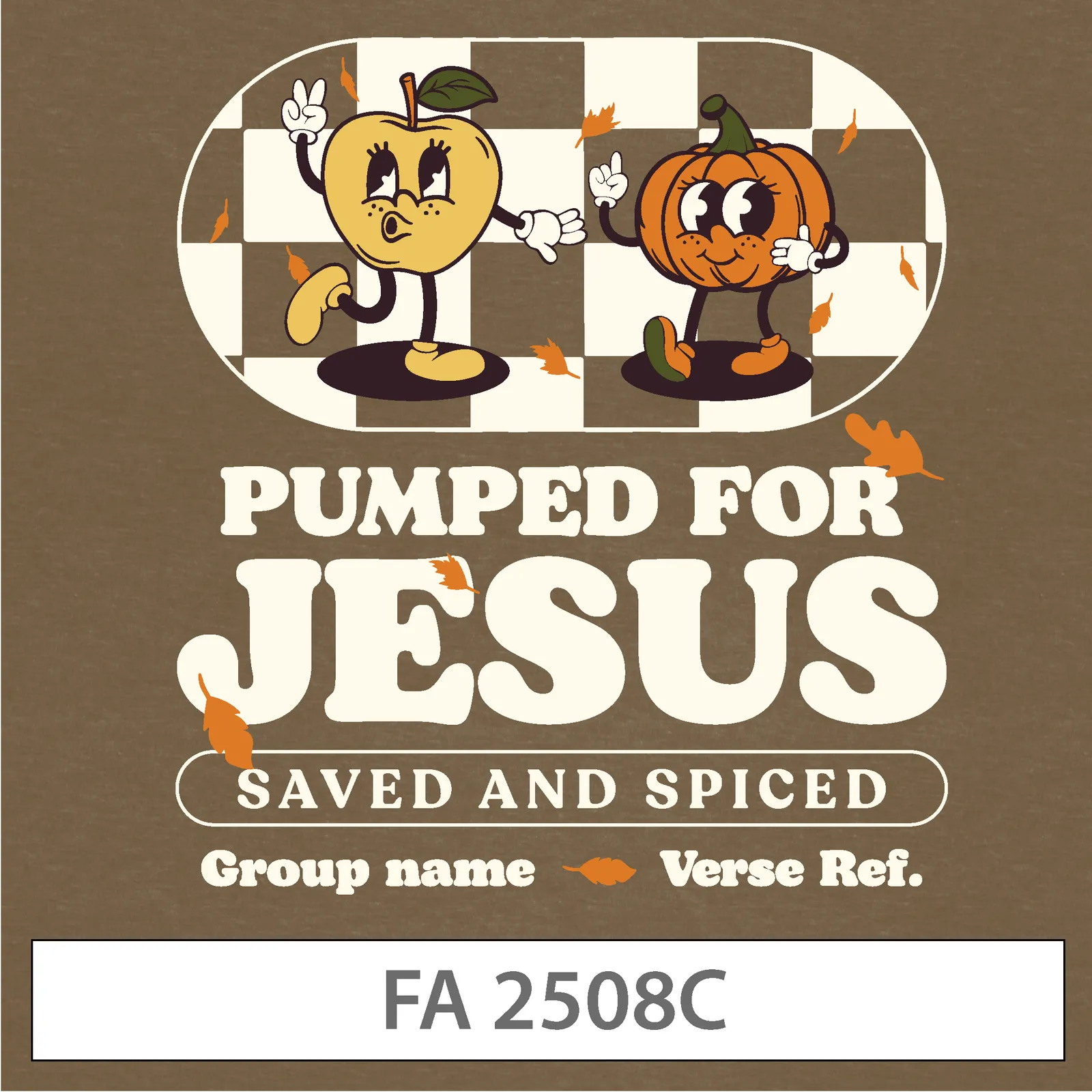
An older design, but still one of our most requested — and it's easy to see why. A dancing apple and pumpkin mascot duo, set against a checkerboard backdrop, paired with bold groovy type reading "PUMPED FOR JESUS, SAVED AND SPICED."
It's playful, a little silly, and exactly the kind of design that gets students excited to actually wear their group shirt outside of church. The retro mascot-character trend has real staying power, and this design is a great example of why.
Why it's trending: Retro cartoon mascots with expressive faces and checkerboard backgrounds have been a consistent apparel trend for a few years running — and for younger student ministries especially, that playful energy tends to outperform more serious designs.
Great for: Youth group fall kickoff, VBS wrap-up events, general fall merch
Every design above is fully customizable — swap in your group's name, verse reference, and color palette, and it's ready to print.
Each design also works across multiple garments, so you're not locked into one product. Most of these were built with both Super-Soft Tees and fleecewear in mind — meaning the same design can carry from a lightweight fall tee into a Super-Soft Hoodie or Super-Soft Crewneck as the weather cools down.
Not sure which one fits your group? A good rule of thumb: if your event leans reflective or outdoorsy, start with Yesterday, Today and Forever or Consider the Ravens. If it leans high-energy or celebratory, Hello, Autumn or Pumped for Jesus is the better call.
People Also Ask
What t-shirt designs are trending for fall right now? Vintage badge illustrations, stacked retro typography, and playful cartoon mascots are all trending in fall apparel this year — all five designs in this post reflect one of those directions.
Can I customize these fall designs with my group's name? Yes. Every design in Sunday Cool's Customizable Design Template library can be personalized with your group's name, verse reference, and color choices.
What garments work best with these fall designs? Most of these designs are built to work on both the Super-Soft Tee and fleecewear, so the same design can transition from a fall tee into a Super-Soft Hoodie or Super-Soft Crewneck.
Are older designs still a good choice, or should we pick something new? Absolutely — a design like Pumped for Jesus has stayed popular for a reason. A strong design doesn't have an expiration date.
Fall is one of the best seasons to make a statement with your group's apparel — cozy palettes, bold type, and just enough personality to make people want to wear it long after the season's over.
%201.avif)


.png)
.png)

.png)
.webp)
-p-1600.png)